WA UI
A shadcn/ui registry of WhatsApp Web components, built directly on WhatsApp's WDS design tokens.
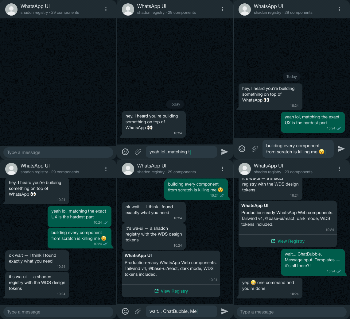
If you're building on top of WhatsApp — whether it's a SaaS platform, a customer support tool, or a Meta Cloud API integration — you shouldn't have to rebuild the UI from scratch. This registry gives you the exact same components, colors, and spacing that WhatsApp uses, ready to drop into your React app with a single command.
·
Install
Each component is independent — install only what you need.
What's included
Design system
Every component uses the WDS (WhatsApp Design System) tokens — the same CSS variables that WhatsApp Web ships. Colors, spacing, border radii, and typography are all sourced directly from WDS, with both light and dark mode variants.
See for the full token reference.
Stack
- Tailwind CSS v4 — utility classes mapped to WDS tokens
- @base-ui/react — accessible primitives (Button, Toggle, Menu, Drawer…)
- shadcn/ui registry — install with
npx shadcn add
License
·