tuiparts.sh — OpenTUI Primitives and Recipes
Build terminal user interfaces with packaged interaction behavior and editable source for OpenTUI Core, React, and Solid. Install Recipes with the official shadcn CLI, then own every presentation decision in your application.
· · ·
Start with a Recipe
Recipes are styled Core, React, or Solid source that you copy into an existing application. Choose a runtime and install a Checkbox Recipe:
The CLI copies the Recipe and its consumer-owned theme into components/ui
and installs its package dependencies. There is no shadcn project setup or
hidden styling runtime. Change the installed source when you need a different
layout, glyph, token mapping, or public API.
or .
Package the difficult behavior. Copy the opinionated layer.
tuiparts.sh separates terminal UI work by ownership:
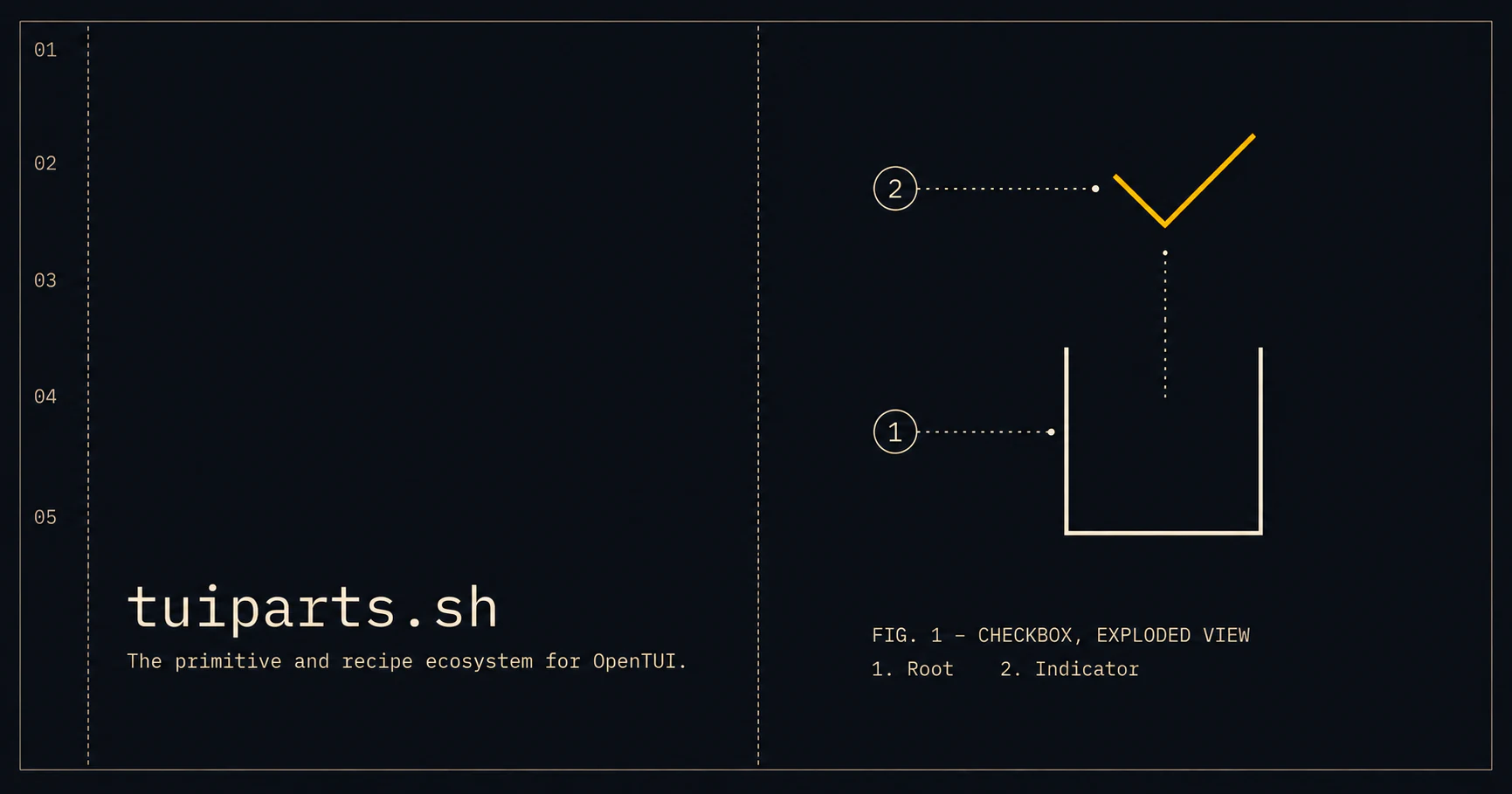
- Primitives package the behavior that is difficult to implement and expensive to maintain: state, focus, keyboard and pointer interaction, collections, overlays, and lifecycle. They expose independently composable public Parts such as Root, Indicator, Thumb, Trigger, and Panel.
- Recipes assemble those Parts into working controls with editable layout, colors, glyphs, labels, variants, and convenience props. The copied source belongs to your application.
Most users should start with a Recipe and reshape it into their house style. Use a Primitive directly when you need its tested behavior without adopting a Recipe's composition or public API.
Behavior is packaged. Presentation is yours.
Read for the layer choice, for the deeper model, and for the public behavior standard.
Catalog
The Catalog includes editable Recipes for Accordion, Badge, Button, Checkbox, Checkbox Group, Collapsible, Dialog, Input, Number Field, Radio Group, Slider, Switch, Tabs, Textarea, Toggle, and Toggle Group. Every Recipe is available for Core, React, and Solid.
Interactive Recipes build on packaged Primitives. Badge is Recipe-only because it has no reusable interaction behavior. Shared colors, glyphs, borders, and density live in the consumer-owned Theme Recipe.
The covers installation,
source ownership, and reviewing upstream changes with the standard shadcn
view, diff, and add lifecycle.
Foundation packages
Core owns the framework-neutral behavior. React and Solid adapt the same Stores and Renderables to compound-part APIs. The three Foundation packages version together.
To compose Primitives directly, add the Foundation package for your runtime to an existing OpenTUI application:
React and Solid install @tuiparts/core; the host application owns its OpenTUI
runtime and framework peers. See each package README for exact peer ranges and
usage.
and are independently versioned Companion products with higher-level APIs outside the Foundation release line.
Development
The repository uses pnpm and Bun. Versions are pinned in package.json and CI.
validate:packages packs the Foundation and changed Companion packages, runs
publint and Are the Types Wrong, installs the tarballs in a clean consumer,
typechecks every exported subpath, and executes representative runtime imports.
Release workflow
- Add changesets for publishable changes.
- Merge the generated version PR after CI passes.
- Publish with npm provenance through the release workflow.
- Validate packed packages in clean consumers before publishing.
Attribution
tuiparts.sh is an independent project built for OpenTUI. It is not affiliated with or endorsed by the OpenTUI or shadcn projects.
(Pronounced "too-ee parts.")
License
MIT