





Documentation
Go to to view the documentation.
About
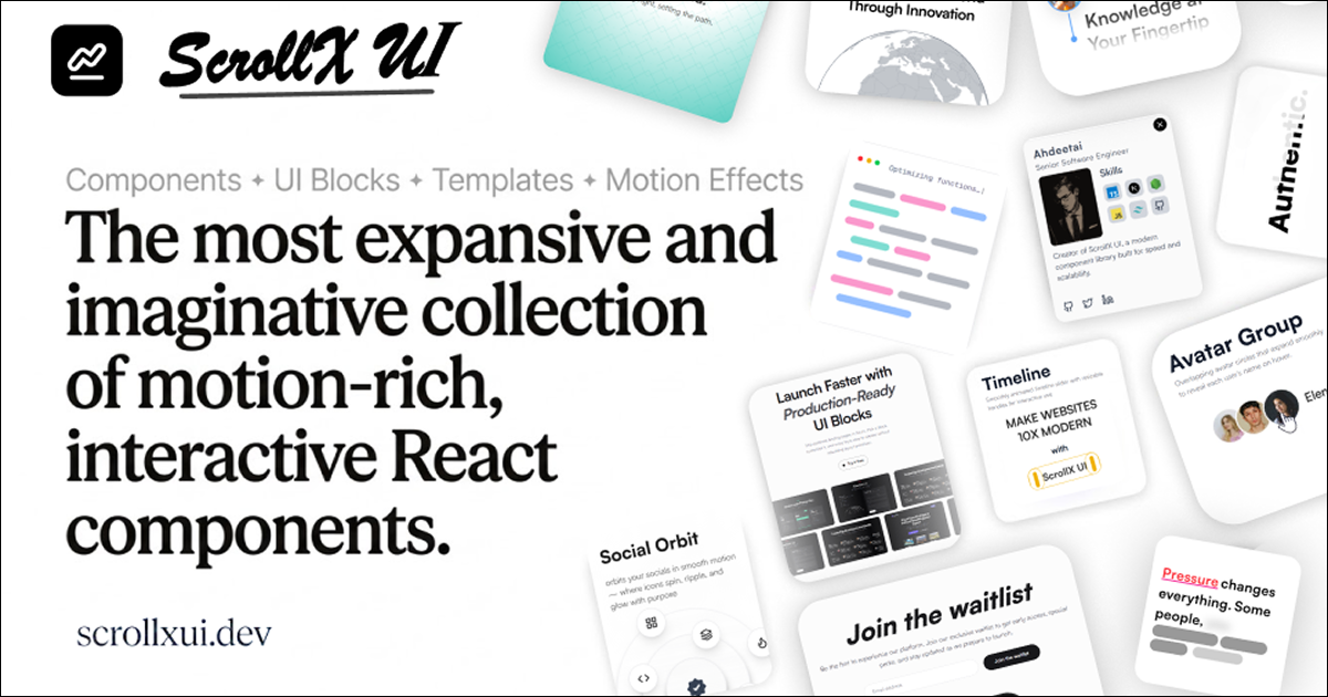
ScrollX UI is a collection of animated, interactive React components & blocks built to help your web interfaces feel modern and alive. The library delivers a broad spectrum of components - from text animations and motion-driven interactions to polished UI elements and dynamic backgrounds and blocks from hero sections to faq sections - all free to use and fully customizable through simple props, giving you exactly what you need right out of the box.
Key Features
- 140+ total components (text animations, animations, interactive components, backgrounds), 30+ blocks and 2+ templates growing every week
- Supports ShadCN registries, GitHub registries, and MCP integration
- All components are built with minimal dependencies, and are highly customizable through props
- You get the code, so you can modify, extend, and personalize every detail
- Designed to integrate seamlessly with any modern React project
- Components come in one clean format: TypeScript + Tailwind for everyone
Installing Components Via CLI
ScrollX UI supports for quick installs.
Each component demo provides CLI commands, ready for you to copy and run. Detailed instructions can also be found .
If the documentation website is unavailable, you can view the same guide on GitHub .
How To Contribute?
Contributions are welcome! Check the to see how you can help or submit ideas using the .
Please review the and follow our standards. Thanks for your time!
Contributors
Maintainers
Stats
License
Licensed under the .