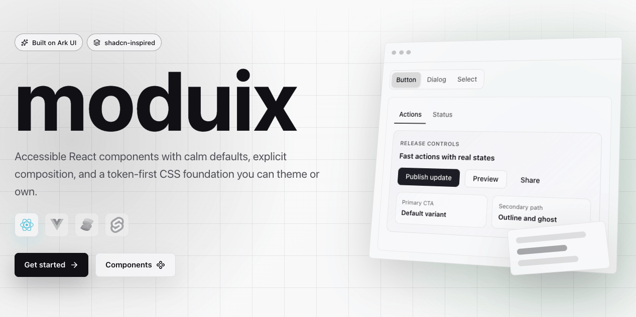
moduix
Product-minded components built on , with accessible behavior, explicit composition, and CSS Modules at the core.
moduix combines Ark UI primitives with considered defaults and a shadcn-inspired ownership model. Use the published package when you want managed updates, or add the component source to your application through the hosted shadcn registry when you want to own it.
· · ·
Why moduix
- Ark-backed behavior. Dialogs, menus, inputs, and other complex interactions keep Ark UI's keyboard support, state management, form behavior, and accessibility semantics.
- CSS Modules by default. Component styles are ordinary CSS with locally scoped class names. There is no styling runtime and no Tailwind requirement.
- Composable APIs. Components expose the useful parts of their anatomy without hiding the primitive structure needed for product-specific UI.
- A predictable styling contract. Shared tokens,
className, stabledata-slothooks, and Ark state attributes give application CSS clear extension points. - Two ownership models. Keep dependencies package-managed or copy component source into your application through the shadcn registry.
Get started
Use the npm package
Install moduix and its Ark UI peer dependency:
Import the shared foundation stylesheet once in your application entry point:
The reset is optional. If you use it, import it before the foundation stylesheet:
Then import component subpaths and compose the parts you need:
Dialog is the recommended root component. Dialog.Root remains available when an explicit
namespace is useful, such as in anatomy documentation or a local abstraction.
Own the source with the registry
Use the registry when a component should live in your repository and evolve with your product. Set
up components.json with the , then add only the
components you need:
The generated source includes the component, its CSS Module, and any required supporting files.
The registry preserves the same component contracts and design tokens as the npm package. Your
components.json aliases determine the destination paths.
Styling and theming
Component styles are bundled with their component imports. style.css supplies the shared tokens
and base layer styles, while each component keeps its own CSS Module. Start with the built-in
appearance, then customize deliberately:
- pass
classNameto a root or named part for application-owned selectors; - target stable moduix
data-slothooks or Ark state attributes for state-specific rules; - override public CSS custom properties at the appropriate theme, semantic, or component layer.
You can also add an optional preset after style.css and activate it on the document root:
The available presets are dense, soft, and contrast. See
and for the complete customization model.
Repository
Install dependencies and run the documentation site locally:
Before opening a pull request, run the repository checks:
Run pnpm run build:registry after changing files shipped by the registry.
Contributing
Contributions are welcome, especially focused component improvements, accessibility fixes, bug reports, and documentation corrections. Keep public component behavior, local component notes, documentation, and registry output synchronized when a public contract changes.
See for repository conventions.
Acknowledgements
- provides primitive behavior and the composition model.
- informs Ark-aligned ergonomics and design-system craft.
- inspires open-code delivery and practical documentation.