shadcn-heatmap
Live demo:
Heatmap components for React, built for .
Built on SVG and Tailwind v4 tokens. Copy the source, own it entirely.
Components
All four are single-file, zero-config components.
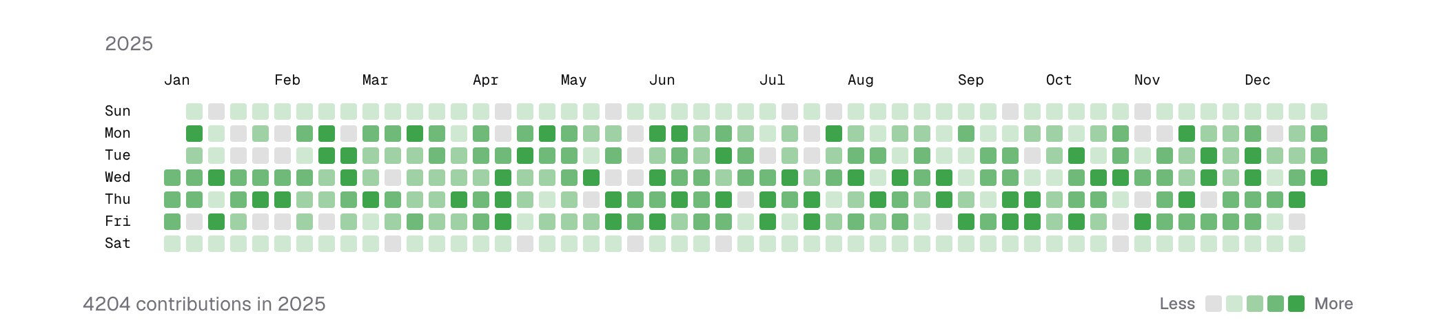
CalendarHeatmap
GitHub-style yearly contribution grid. Supports multiple years, ISO Monday start, custom colors, i18n labels, and full tooltip control.
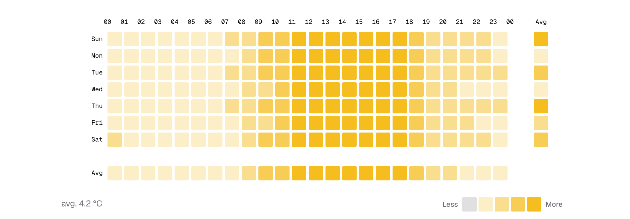
WeekdayHeatmap
Weekday × hour-of-day matrix for recurring weekly patterns. Supports optional aggregate rows and columns with custom compute functions, i18n, and custom colors.
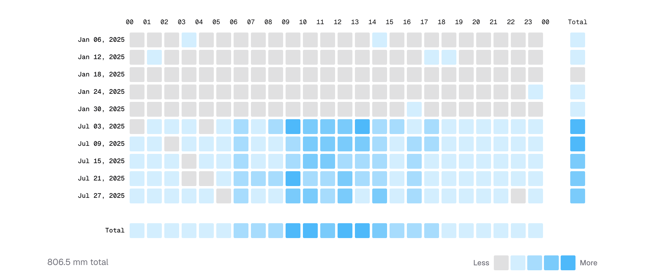
DateHeatmap
Date × hour grid for zoomed time windows (1–4 weeks). Supports optional aggregate rows and columns with custom compute functions, i18n, and custom colors.
StatusHeatmap
Daily status timeline for uptime or incident history. Four status levels (healthy / degraded / critical / no data), custom colors, i18n, and adjustable label intervals.

Requirements
- React 19+
- Tailwind CSS v4
- shadcn/ui project setup
Installation
See the for the interactive walkthrough. The steps below mirror it 1-to-1.
shadcn CLI (recommended)
-
Install via
shadcn@latest. Pick the component you need — the CLI writes it into your project'scomponents/heatmap/directory.@heatmapis an official , listed in the . Alternatively, install from the full URL:npx shadcn@latest add https://heatmap.chingru.com/r/calendar-heatmap.json, or straight from this GitHub repo:npx shadcn@latest add rutopio/shadcn-heatmap/calendar-heatmap. -
Ensure the runtime dependencies exist. The components only need these — the CLI installs them automatically, listed here for reference.
-
(Optional) Add a tooltip for hover details. The components render fine without it; the demos wrap blocks in a tooltip to show activity details on hover. Use any tooltip you like, or the shadcn one:
Manual
-
Install peer dependencies.
-
Add the
cnhelper (if not already present). Createsrc/lib/utils.ts: -
Expose theme tokens used by the blocks. The heatmaps reference
--color-chart-1for activity colors,--color-secondaryfor empty cells, and--color-muted-foregroundfor labels. You can customize these via thecolorsprop. -
(Optional) Add a tooltip for hover details. The components render fine without it; the demos wrap blocks in a tooltip to show activity details on hover.
-
Copy the component you need from on GitHub and place it under
src/components/heatmap/in your project.
Usage
CalendarHeatmap
WeekdayHeatmap
DateHeatmap
StatusHeatmap
See the for full examples of all four components, including tooltips, i18n, and custom colors.
Contributing
Contributions are warmly welcome. Whether it's a bug report, a new variant idea, a11y improvement, or docs polish — feel free to open an or send a pull request.
If you're adding a new component or changing the public API, please open an issue first so we can align on scope before you write the code.
Local setup
Requires Node 22+ and pnpm 11.
Commits and branches
- Branch from
masterusing a short descriptive name (fix/status-empty-data,feat/binary-heatmap). - Keep commits focused; prefer a series of small commits over one large one.
- Commit messages are lowercase imperative, short (see recent history for the flavour).
Before opening a PR
Run the same checks CI runs — merges are blocked if they fail:
If your change touches a component in src/components/heatmap/, open the demo site and verify the affected variant renders correctly — there is no test suite, so visual verification is the safety net.
License
MIT License