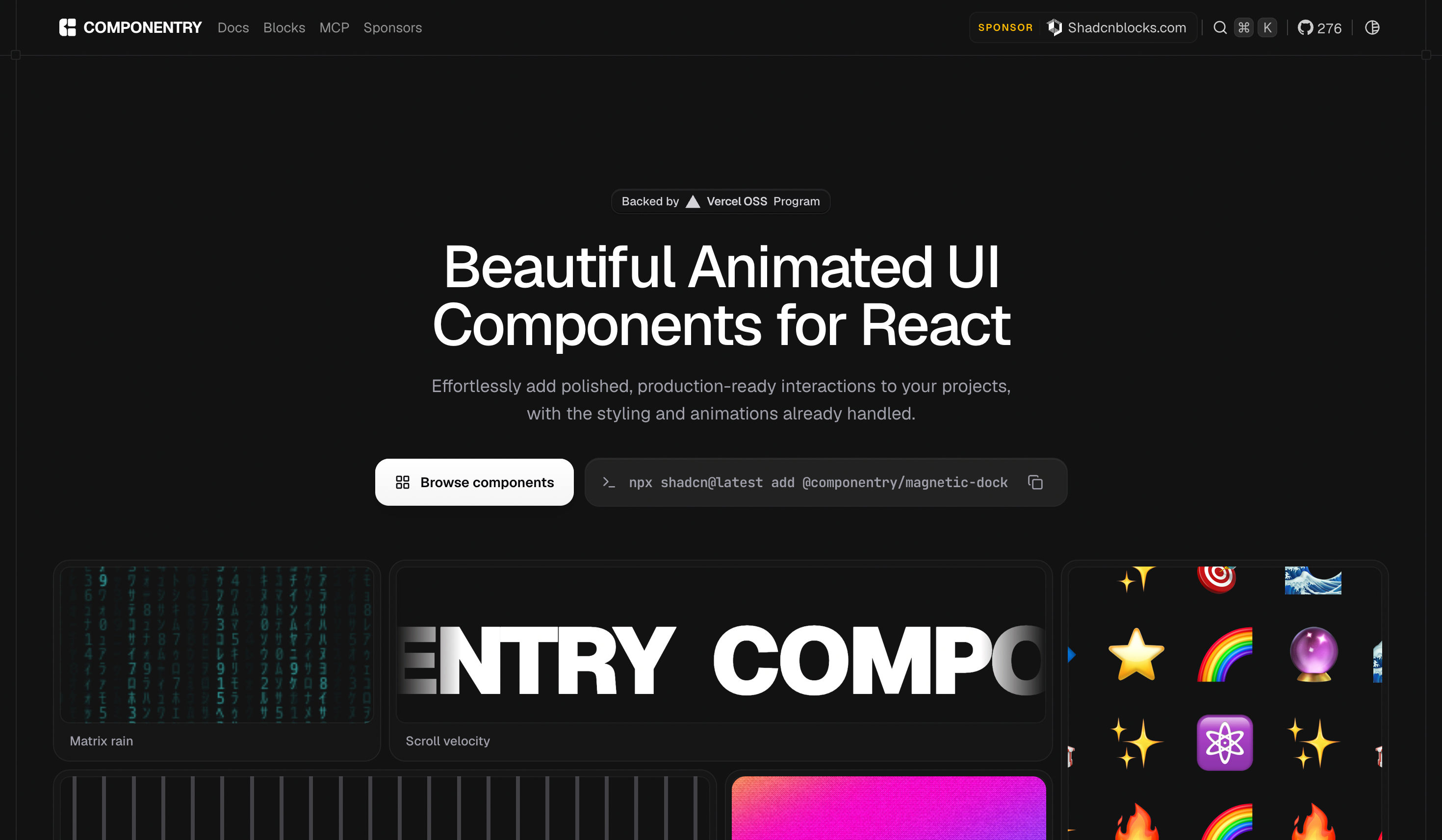
Componentry
Beautiful, interactive UI components you can copy and paste into your apps.
Crafted with React, Tailwind CSS, and Framer Motion. Open source. Free forever.
· · ·
Introduction
Componentry is a collection of beautifully designed, interactive UI components built with React and Tailwind CSS. Just run the CLI command, add the component to your project, and start building.
Why Componentry?
- Copy & Paste - Not a dependency. You own the code.
- Interactive - Cursor-following effects, 3D transforms, and smooth animations.
- Customizable - Built with Tailwind CSS. Easy to modify.
- Accessible - WAI-ARIA compliant components.
- Dark Mode - All components support light and dark modes.
- TypeScript - Fully typed for the best developer experience.
Quick Start
Installation via CLI
The fastest way to add components is using the shadcn CLI:
Development
This project uses for monorepo management.
Prerequisites
- Node.js 20+
- pnpm 10+
Setup
Project Structure
Available Scripts
Contributing
We welcome contributions! Whether it's:
- Reporting a bug
- Submitting a fix
- Proposing new features
- Creating new components
How to Contribute
- Fork the repository
- Create your feature branch (
git checkout -b feature/amazing-component) - Commit your changes (
git commit -m 'Add amazing component') - Push to the branch (
git push origin feature/amazing-component) - Open a Pull Request
Component Guidelines
When creating new components:
- Use TypeScript with proper type definitions
- Support both light and dark modes
- Include comprehensive props with sensible defaults
- Add smooth transitions and animations
- Write clear documentation with examples
- Follow existing code style and patterns
Tech Stack
- Framework:
- Styling:
- Components:
- Build:
- Package Manager:
License
MIT License - feel free to use these components in personal and commercial projects.
Third-Party Licenses
Some components use third-party dependencies with separate license terms.
image-trailandlayered-stackrequiregsap(GSAP).- If you use or redistribute those components, you are responsible for complying with GSAP's license terms.
- GSAP license:
See for more information.
Acknowledgments
- Inspired by
- Built with
- Powered by
Made with care by