AnimBits

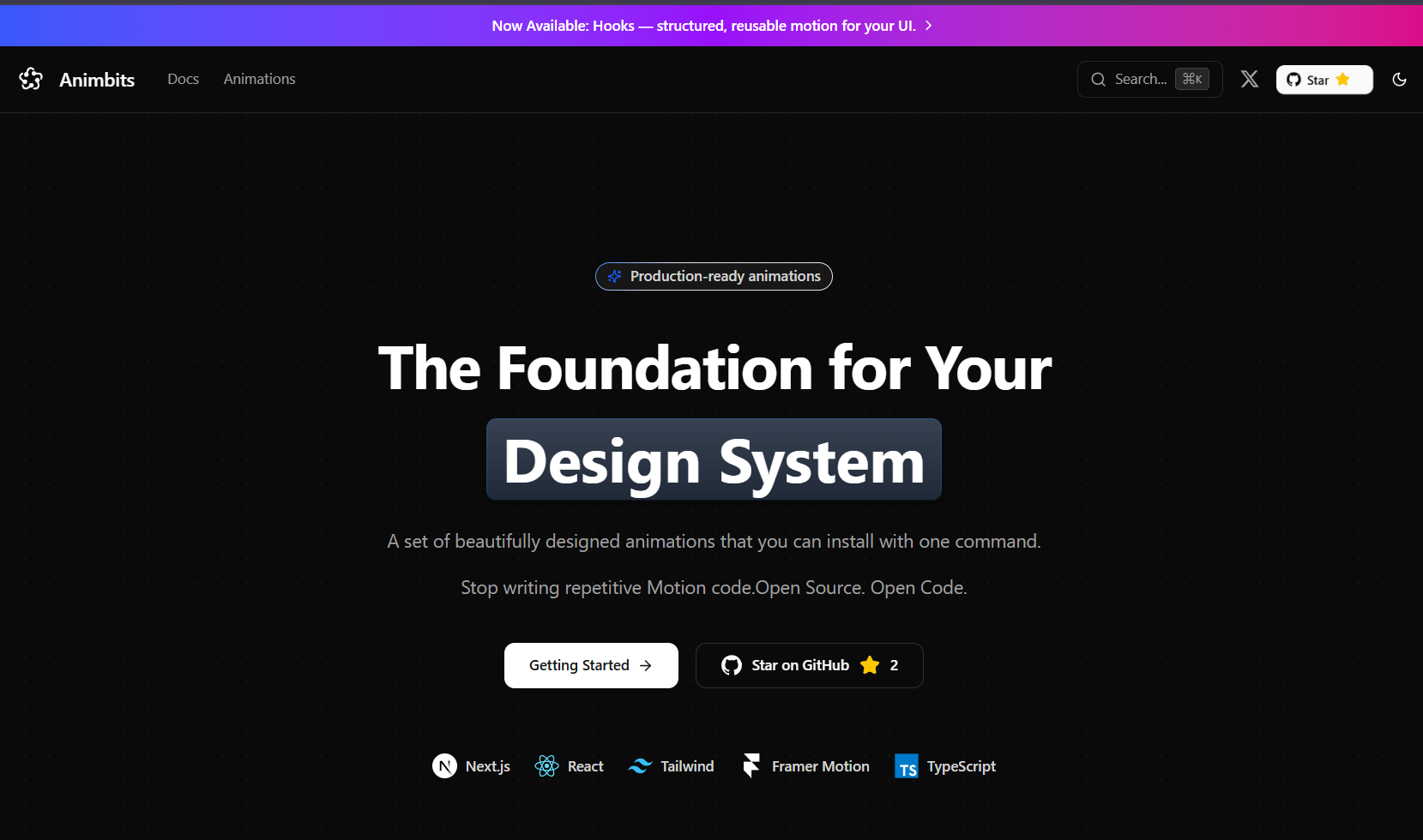
AnimBits Hero

Production-Ready Animation Components for React

A beautifully crafted collection of copy-paste animation components powered by Framer Motion. Install with one command, customize with simple props.

· ·


Features

  • 50+ Animation Components - Icons, buttons, cards, loaders, transitions, and more
  • One-Command Install - Use the shadcn CLI to add animations instantly
  • Simple Prop API - Customize animations with intuitive props
  • Zero Config - Works out of the box with Next.js, Vite, and more
  • Fully Typed - Built with TypeScript for excellent developer experience
  • Dark Mode Ready - All animations work seamlessly in light and dark themes
  • Responsive - Optimized for all screen sizes
  • Accessible - Respects prefers-reduced-motion settings

Quick Start

Installation

Install any animation component with a single command:

bash
npx shadcn add https://animbits.dev/r/buttons-lift.json

Usage

tsx
import { LiftButton } from "@/components/animations/buttons/lift"
export default function App() {  return (    <LiftButton className="px-6 py-3 bg-blue-600 text-white rounded-lg">      Hover me!    </LiftButton>  )}

That's it! No configuration, no setup, just beautiful animations.

Component Categories

Icons

Bring your icons to life with smooth, performant animations.

bash
npx shadcn add https://animbits.dev/r/icons-heartbeat.jsonnpx shadcn add https://animbits.dev/r/icons-pulse.jsonnpx shadcn add https://animbits.dev/r/icons-bounce.json

Available: Heartbeat, Pulse, Bounce, Spin, Wiggle, Shake, Pop, Rotate, Stroke Draw, Fade In, Scale In

Buttons

Interactive button animations that enhance user experience.

bash
npx shadcn add https://animbits.dev/r/buttons-ripple.jsonnpx shadcn add https://animbits.dev/r/buttons-magnetic.jsonnpx shadcn add https://animbits.dev/r/buttons-glow.json

Available: Ripple, Magnetic, Glow, Lift, Press, Shine, Border Gradient, Fade In, Slide In

Cards

Elegant card animations for modern interfaces.

bash
npx shadcn add https://animbits.dev/r/cards-parallax-tilt.jsonnpx shadcn add https://animbits.dev/r/cards-hover-glow.jsonnpx shadcn add https://animbits.dev/r/cards-hover-lift.json

Available: Parallax Tilt, Hover Glow, Hover Lift, Fade In, Scale In, Slide In, Blur Fade, Grayscale

Text

Eye-catching text animations and effects.

bash
npx shadcn add https://animbits.dev/r/text-shimmer.jsonnpx shadcn add https://animbits.dev/r/text-scramble.jsonnpx shadcn add https://animbits.dev/r/text-word-carousel.json

Available: Shimmer, Scramble, Word Carousel, Gradient, Typewriter

Lists

Staggered animations for list items and grids.

bash
npx shadcn add https://animbits.dev/r/lists-stagger-fade.jsonnpx shadcn add https://animbits.dev/r/lists-slide-in.json

Available: Stagger Fade, Slide In, Scale In, Blur Fade

Loaders

Beautiful loading indicators for better UX.

bash
npx shadcn add https://animbits.dev/r/loaders-orbit.jsonnpx shadcn add https://animbits.dev/r/loaders-morphing.jsonnpx shadcn add https://animbits.dev/r/loaders-gooey.json

Available: Orbit, Morphing, Gooey, Dots, Spinner, Pulse, Liquid Progress

Transitions

Smooth page and theme transitions using View Transitions API.

bash
npx shadcn add https://animbits.dev/r/transitions-theme-toggle-circular.jsonnpx shadcn add https://animbits.dev/r/pages-page-transition-fade.json

Available: Theme Toggle (Circular, Slide), Page Transitions (Fade, Slide)

Hooks

Reusable animation hooks for custom components.

bash
npx shadcn add https://animbits.dev/r/hooks-use-hover-lift.jsonnpx shadcn add https://animbits.dev/r/hooks-use-magnetic.json

Available: Hover Lift, Hover Glow, Magnetic, Parallax Tilt, Press, Fade In, Scale In, Slide In, and more

Examples

Magnetic Button

tsx
import { MagneticButton } from "@/components/animations/buttons/magnetic"
<MagneticButton   strength={0.3}   className="px-8 py-4 bg-gradient-to-r from-purple-600 to-pink-600 text-white rounded-full">  Magnetic Effect</MagneticButton>

Theme Toggle with Circular Ripple

tsx
import { ThemeToggleCircular } from "@/components/animations/transitions/theme-toggle-circular"import { useTheme } from "next-themes"
export function ThemeToggle() {  const { setTheme } = useTheme()    return (    <ThemeToggleCircular       onToggle={() => setTheme(theme === 'dark' ? 'light' : 'dark')}      speed={0.5}      blur={0}    >      <button>Toggle Theme</button>    </ThemeToggleCircular>  )}

Parallax Tilt Card

tsx
import { CardParallaxTilt } from "@/components/animations/cards/parallax-tilt"
<CardParallaxTilt tiltMaxAngle={15} glareEnable={true}>  <div className="p-6 bg-white dark:bg-neutral-900 rounded-xl">    <h3>Interactive Card</h3>    <p>Hover to see the 3D tilt effect</p>  </div></CardParallaxTilt>

Development

Prerequisites

  • Node.js 18+
  • pnpm (recommended) or npm

Local Setup

bash
# Clone the repositorygit clone https://github.com/Garvit1000/AnimBits.gitcd AnimBits
# Install dependenciespnpm install
# Build the registrypnpm registry:build
# Start the development serverpnpm dev

The site will be available at http://localhost:3000

Testing Components Locally

bash
# In your test projectnpx shadcn add http://localhost:3000/r/buttons-lift.json

Contributing

Contributions are welcome! Whether it's:

  • Bug reports
  • Feature requests
  • Documentation improvements
  • New animation components

Please feel free to open an issue or submit a pull request.

Adding a New Component

  1. Create your component in registry/new-york/animations/[category]/[name].tsx
  2. Add the component entry to registry.json
  3. Create documentation in content/docs/animations/[category]/[name].mdx
  4. Run pnpm registry:build to generate the registry files
  5. Test locally and submit a PR

License

MIT ©

Acknowledgments

  • Built with and
  • Powered by
  • CLI integration via
  • Documentation with

·

Made with love for the React community